Layout Options
Tab Navigation Each spot represents a tab spot in the navigation bar. You can choose to show tabs in any order. If you leave any blank, the tab won’t show up. Since you can choose to add as many settings and as many calendars as you’d like, you can create special purpose versions of your calendar and switch between them for different purposes.
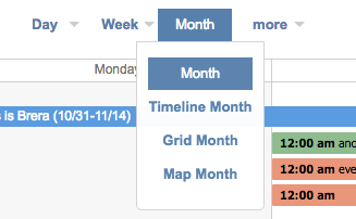
You can choose from among the following types of views for each tab (see our view page for examples of the different views available):
- Day
- Week
- Month
- Year
- Unit/Resource (a breakdown of resources, people, rooms, etc. in a column view)
- Planner (same as Unit/Resource but for a whole week)
- Timeline (time along the top, resources along the left, available as daily, weekly monthly, annually, and dynamic)
- Map Scheduler (show all the events for a specific timeframe on a Google map, available as daily, weekly monthly, annually)
- Grid (a sortable list view of events, available as daily, weekly monthly, annually and future events)
- Weekly Wide (an agenda-like view of your week, Monday to Wednesday on the left, Thursday through Sunday on the right)
- Menus for:
- Day/Week/Month
- All Resources
- All Timelines
- All Maps
- Misc (Year, Dynamic Timeline & Future Grid)
Navigation Options In addition, there are a couple of important options to know about.
Interface Type
- Standard – minimal graphics, heavily customizable using Themes
- Glossy – graphic-enhanced layout including gradient buttons and tabs. The color of the buttons and tabs cannot be customized using Themes. But many other elements, such as the fonts, the background and event display can still be customized.
- Terrace – modern, stylized, “flat” layout design. Heavily customizable using Themes.
- Mobile – choosing this selection changes the look and behavior of your calendar for smartphone and other very small screens. There’s far less customization for the mobile theme, and the layouts will ALWAYS include Day, Week and Month. The tab navigation choices above have no impact on Mobile layouts. Theme changes are not as far-reaching.
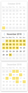
Calendar Navigation
- Add or remove mini monthly calendars from the sidebars of the calendar.
- You can choose from One, Two or Three calendar months to be displayed at a time, on the right or on the left.
- These can also be removed using dynamic url settings
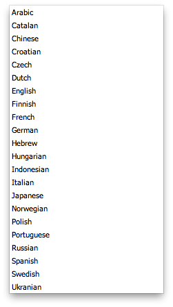
Language Choose from 22 different languages.
- In this section:
- Tabs/Views
- Interface Types
- Mobile
